Increase Conversions to Grow Your Sales Funnel
Maximize your impact by starting with well-designed pages that follow best practices for your direct response pages. Once your demand generation pages launch, conversion rate optimization should be ongoing. This means that you should have a test plan, ongoing monitoring, and KPIs for measurement.
There are several elements to consider when designing landing pages:
Gated Landing Page Definition
OPTIMIZE LANDING PAGE CONTENT
PROVIDE A POSITIVE USER EXPERIENCE
CONTACT FORMS THAT CONVERT
What Are Gated Landing Pages?
Gated landing pages are often used in inbound marketing initiatives with long-form content. Long-form content includes various types of content, such as
- White papers
- Infographics
- Webinars
Gated landing pages are common in business to business (B2B) marketing and content marketing.
Gated pages keep site visitors focused on the action desired by the company. This is typically used for marketing campaigns where the key performance indicator (KPI) is leads generated. The only choice the visitor has is to
- Enter their information, or
- Click the logo to go to the home page (sometimes), or
- To leave the site (bounce).
Long-form content is often used in inbound marketing as a way to gather personal information from prospects, such as email addresses. Website visitors are then requested to provide personal information before the content in unlocked.
Optimize Landing Page Content
There are several ways to optimize landing page content.
Messaging
Ensure the copy on your landing page matches how people are searching for your products and services. In addition, the landing page should contain consistent call to action with any ads you are running to promote your content.
KEY ACTION
Use common industry terminology. Your landing page should not contain jargon that is mostly used internally at your company.
Call To Action
A call to action is the next step you want your site visitors to take. Always have a single call to action on the landing page, which is clearly visible above the fold and consistent throughout the page.
KEY ACTION
Mention your call to action throughout the page. This may include in the H1 heading, page copy, as well as above your lead generation form and / or on the submit button on your contact form.
Badges & Privacy Policy
Trust is important when beginning any kind of relationship. Show your potential leads that you care about them and that your company is creditable.
KEY ACTION
Include a privacy policy, industry certifications, and client logos / testimonials to establish your business.
Provide A Positive User Experience
There’s nothing worse than going to a new website only to find out that it doesn’t work on your browser, or the content doesn’t load on your mobile device. Ensure that you are putting your best foot forward to new leads by taking the following key next steps:
Mobile First Optimization
Studies have shown that 40% of users will bounce if your site is not mobile friendly. Make sure your website looks good on mobile devices by using free tools, such as:
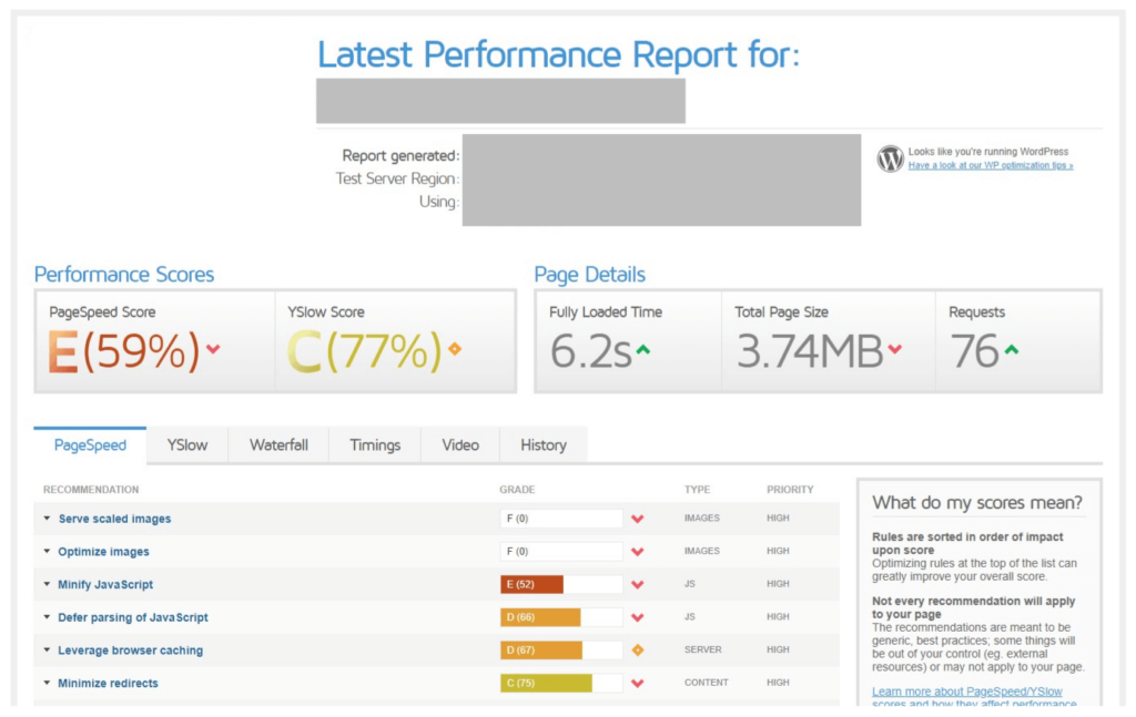
The performance report is an easy way to see if the web team can take steps like minifying JavaScript, or image optimization to ensure a smooth user experience.
Checking how your site renders on mobile and even across different browsers / screen sizes can pay big dividends. We have seen several instances where popups that functioned OK on desktop ended up blocking the ability to see and fill out the form on smaller screen sizes.

Contact Forms that Convert
There are many variables to consider when it comes to creating your contact form. For example, form placement and length, and even field names all change conversion rates. To increase your contact form conversion rates, keep the following tips in mind:Placement of Contact Forms on Landing Pages
- RIGHT-HAND SIDE
- ABOVE THE FOLD
Contact Form Fields Recommendations
Form fields are where the user provides information about themselves. It’s tempting to ask for all the information you’d like to have for the sales call; however, you have to be careful to ask for only what’s needed to maximize your conversion rates.- Remove optional fields to reduce perception of difficulty, as well as the time required to fill out the form.
- Remove open-ended fields for a message wherever possible.
- Reduce fields to only minimum of what’s required for sales qualification / lead scoring. This can be a great exercise in partnering with your sales team to improve marketing performance.
Clear & Concise Call To Action Submit Button
Replace your “submit” buttons with straightforward and concise call to action buttons, such as- Sign Up
- Download Now
- Contact Us
Dedicated Thank-You Page
Redirect your visitors to dedicated thank-you pages to improve the user experience after form submit. Having a unique thank-you page has several benefits, including:- MAKES TRACKING EASIER
- CREATES ANOTHER OPPORTUNITY TO ENGAGE WITH VISITORS
- SETS EXPECTATIONS
Develop A / B Testing Plans
Last but not least, always test your landing pages for better conversion rates. Change only one variable each time to better understand and identify what changes worked or didn’t work. For instance, testing different call to actions at a time while all other elements on the page remain the same, such as- “REQUEST DEMO” vs. “CONTACT US”
- “DISCOVER 3D LISTINGS” vs. “LEARN MORE”.
